It was proposed by Business Insider UK that an ugly font will force students to concentrate harder on what they’re reading compared with a font like Times New Roman. Since they will be focused more on the text, they will absorb more content and be able to recall the information more effectively. You can view the entire video below.
The Process:
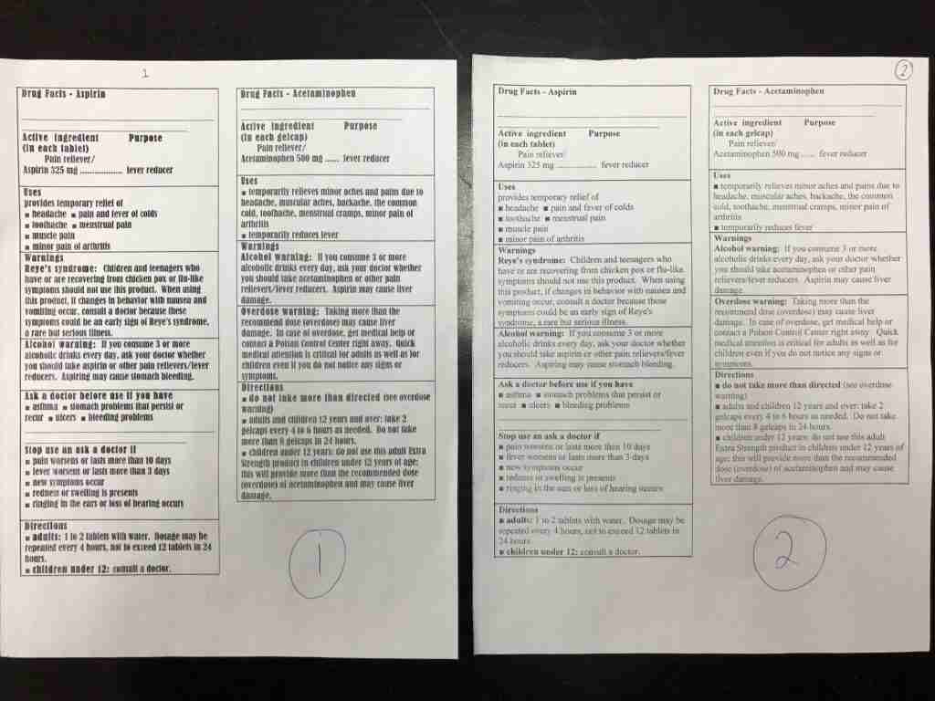
After watching the video, I wanted to try it out in my own class. If the type of font truly mattered, I wanted to know. I found a simple reading online that compared Acetaminophen and Aspirin. Luckily, The reading came with 15 multiple-choice questions. I created two identical readings one of which used Times New Roman font and the other Bernard MT Condensed. I choose the Bernard MT Condensed font as I found it very difficult to read. Within each of my three classes, I gave half the students each version of the reading and allowed them 3.5 minutes to read it. I then took the paper away, waited 2 minutes then gave them the 15 multiple-choice questions in an easy to read font.
My Results:
After doing this with three classes (58 students), the differences weren’t significant. Specifically, I saw a 3% increase in performance (9.21 vs. 8.97 out of 15) for the group with the easy to read, Times New Roman, font. This contradicted the findings from Business Insider but I admit that my sample size was too small to be conclusive.

What do you think? Does font matter?
Devon
I read something similar but it related to serif (e.g., Times New Roman) vs sans serif (e.g., Arial) fonts. It said that students will think a task or reading is easier if given in a sans serif font and not take it seriously or put in as much effort (because it is deemed as easy). Tasks/readings given in serif fonts look a little more complicated (professional?) and therefore students will take the task/reading more seriously. I have not done an experiment on this however.